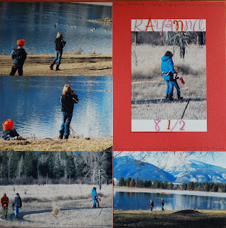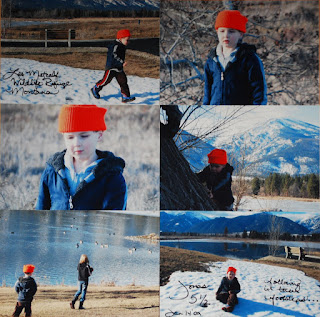
 Here are the two layouts I did for R & J. Simple and quick. I got 6 *full-size* 4x6 photos (I frequently crop photos w/cutter to cut down on visual clutter, and to make more room.) on J's page. (thrifty, and why I prefer to scrap in 12x12). This was made possible by journaling directly on the photo w/my photo marker. It does feel *wrong*when you first write on photos, but once you do it, it's quite fun. For me, the fun is that it allows me to actually use more photos... I would have one less photo to display on J's page if I hadn't written on the photo. Another thrifty tip - if you're going to fill up a page, it doesn't matter what paper you use. Use up your ugly paper - you will end up seeing very little of the actual cs (cardstock). Crazy patterns in your pad that you think you'll never use - they work great for photo-filled pages. R's layout - I selected borders (in printing "preferences") on the focus photo. My plan was to write on the borders, but I decided to use stickers instead. I still think it made for a nice, thrifty embellishment. Covering the rest of the cardstock with photos makes the focus photo appear to be framed.


No comments:
Post a Comment