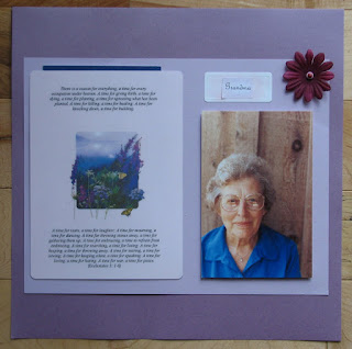
 Top page: I copied a photo C took of his grandma when he was young and in 4-H. I used 3-d adhesive to make this lovely photo stand out. The scripture card was given to me by C's mom, from the funeral home. I made a pocket from it and inserted the memorial service brochure (blue edge) inside. It was a lovely brochure and I wanted to save it without making it a focal point of the layout. I also made a copy of the backside of the scripture card (extended obituary) and inserted into the pocket, as well.
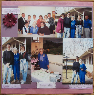
Bottom page: These photos were taken when I first met Alice. We went to Lincoln for her 80th birthday celebration and spent the weekend, along with the rest of the family, at her home in Lincoln. Also pictured are C's parents, uncle, sister, brother and wife. I made copies from the original photos. I used pearlescent paper, decorative edge scissors, and pastel chalks in both pages. The font is just from WordPad.
This layout defined my scrapping philosophy. It was with C's family in mind that I first decided to do this layout. I went back and forth over what pictures to include, how to collect the pictures, etc.... Ultimately, I became more inspired by my own memories and decided that I wouldn't be able to do justice to a layout with the family's past memories, anyway - those are special and unique to them. Sooo, if you are passionate about something that is uniquely meaningful to you, then create for yourself - others will probably enjoy it too! (I do plan to add another page of photos of Grandma and my kids - those photos are more spread out, so I'll just collect them as I come across them to scrap at a later time.)


Lovely layout. Thanx 4 sharing.
ReplyDeleteKathleen W.
Thank you!
ReplyDelete